
You did everything right. Your product page looked great, the buyer added items to their cart, and they clicked "checkout." But then, they left without completing the purchase. A confusing form or a slow loading screen is enough to break a customer's trust at the final second.
Research shows 65% of ecommerce sites score "mediocre" or below on checkout usability. For businesses selling to customers in other countries, the friction gets worse with currency issues, unfamiliar payment methods, and card declines. Checkout optimization is the process of removing these technical and psychological barriers to ensure more "Add to Carts" turn into successful orders.
This guide covers in detail what checkout optimization is and explores 16 practical tips you can implement right away to improve your checkout and recover lost revenue.
Every online purchase ends at checkout. It's the last step where a buyer enters their details, picks a payment method, and confirms the order. Checkout optimization is the process of making that step as smooth and fast as possible, so more buyers actually finish.
For a business in India selling to customers in the US, UK, or the Middle East, checkout optimization is especially essential. Your buyer might see a currency they don't recognize, a payment form that doesn't feel familiar, or a card decline they can't explain. Each of those moments is a reason for cart abandonment or drop-off at checkout.
For example, an Indian D2C brand selling handmade bags gets solid traffic from the UK. Buyers add products to their cart, but most leave at checkout. Why? The checkout only shows prices in INR, requires account creation, and doesn't accept local UK payment methods. Fixing those issues is checkout optimization in action.
Tip: Start by watching how your own checkout looks from a buyer's perspective in your top three countries. Open it on a phone, in a different browser, and from a different location.
A buyer who reaches your checkout page has already decided they want your product. Losing them at this point is the most expensive kind of lost sale because you've already paid to get them there.
A strong checkout experience is one of the few places where a single improvement can directly increase your revenue, without spending more on advertising.
Most abandoned carts aren't random. Buyers leave for specific, fixable reasons, and knowing those reasons helps you prioritize what to change first.
Most of these issues can be fixed through design and payment configuration, not by rebuilding your entire store. The best practices below walk you through how.
Even small improvements to your checkout flow can turn abandoned carts into completed orders. Here are some best practices and tips to help you optimize your checkout:
A checkout with 20+ fields feels slow, especially on a phone. Fewer fields always perform better. Combine first and last name into one field, auto-fill city and state from the postal code, and hide optional fields behind a link. Every field you remove gets more buyers to the finish line.
Most browsers can auto-fill names, addresses, and card details if your form fields are set up correctly. Make sure your checkout supports this. Set billing address to match shipping address by default, and use address lookup so buyers can pick their full address after typing a few characters. These small touches save time and reduce typing errors, which matters even more on mobile.
Surprise shipping fees, taxes, or international transaction fees at the last step are a top cause of abandonment. Display the full total, including all charges, on the cart page itself, before the buyer enters checkout. Show estimated delivery dates instead of vague shipping speeds, and keep your return policy visible near the order summary. Transparency early in the process builds trust and keeps buyers moving forward.
If your checkout only shows Visa and Mastercard, you're losing customers in markets where cards aren't the first choice. Identify the top two or three payment methods in each of your biggest markets and add them to your checkout.
Showing prices in INR to a buyer in the UK forces them to do mental math. That friction is enough to close a tab. Use multi-currency accounts to display prices in GBP, USD, EUR, or whatever currency your buyers expect. You can still settle in your preferred currency on the back end.
Over half of global ecommerce traffic comes from phones. Your checkout should be built for a small screen first, not adapted from a desktop as an afterthought. Make buttons large enough to tap, keep forms short, and match the keyboard type to each field (numbers for phone, email for email). Test the full flow on at least two phone models before you go live.
Buyers are most nervous right before they enter their card details. Place security badges, card network logos, and a short return policy summary near the payment button. If you accept Apple Pay or other recognized wallets, show those logos prominently. Trust signals placed at the point of hesitation reduce last-second drop-offs.
A simple bar or step counter shows buyers how close they are to finishing. This is especially helpful in multi-step checkouts where the buyer can't see the end. Even a label like "Step 2 of 3" reduces uncertainty and keeps buyers moving forward instead of closing the tab.
Use the buyer's location or browser settings to pre-select their country, currency, and relevant payment gateway options. This saves time and removes a decision the buyer shouldn't have to make. If the auto-detection is wrong, let them change it easily with a dropdown.
Tip: Test your auto-detection by browsing your checkout as if you were in your top five buyer countries. If it defaults to the wrong currency or payment options, fix it before your real customers notice.
"Payment failed. Try again." is one of the worst things you can show a buyer. If a card is declined, tell them why (if possible) and suggest a next step. If a form field has an error, highlight it in real time instead of waiting until they press "pay." Good error handling, including clear messaging around payment failures, is the difference between a retry and an exit.
A buyer stuck on a payment issue during checkout won't wait for an email reply. A live chat widget or chatbot on the checkout page gives them a way to get help without leaving. This is especially useful for international buyers who might have questions about currency, payment methods, or delivery to their country. Even a short FAQ link near the payment form can prevent an exit.
A checkout page that takes more than three seconds to load loses buyers, especially on mobile with slower connections. Compress images, reduce scripts, and load payment elements asynchronously. Even a one-second improvement in page speed can make a measurable difference in your completion rate.
If you sell subscriptions, memberships, or charge on a schedule, your checkout needs to handle automatic billing on international cards. Buyers shouldn't have to re-enter payment details every cycle. Look for a payment provider that manages recurring payments end-to-end, including retries for failed charges.
International card transactions fail more often than domestic ones due to issuer rules, fraud screening, and incomplete transaction data. Work with a payment provider that sends enriched data to card issuers and routes transactions through the best path for each country. A drop in decline rates directly increases your revenue.
Don't guess which checkout version works better. Test one change at a time, whether it's button color, form layout, payment method order, or the wording on your "pay now" button. Measure conversion rate, not just page views. Small, data-backed improvements compound into significant lifts over a few months.
The checkout doesn't end at the payment confirmation. Your order confirmation page is a chance to build trust, prompt account creation, and encourage a second purchase. For international buyers, showing expected delivery timelines and a clear way to track their order reduces post-purchase anxiety. A smooth post-checkout experience turns first-time buyers into repeat customers.
Tip: If you sell in more than five countries, prioritize improvements in the markets that generate the most revenue first.
Not every checkout looks the same. The structure you pick affects how long the process feels and how many buyers finish it. Here's a quick comparison:
Each type works well in different situations, so the right choice depends on your product, your buyer, and the average order value.
Everything lives on one page. The buyer fills in shipping, billing, and payment details without navigating away. This works well for simple orders where the buyer already knows what they want. The downside is that a long page can feel overwhelming on mobile. If you sell a single product or run a subscription, this is often the fastest path to purchase.
The process breaks into separate steps, usually shipping, payment, and review. A progress bar at the top shows buyers how close they are to finishing. This format works well for higher-value orders or when you need to collect more information. It reduces the feeling of being overwhelmed, but each additional step is a chance for the buyer to leave.
Returning buyers skip the form entirely. Their saved address and payment details auto-fill, and they confirm with a single tap. This is ideal for repeat buyers and subscriptions. It requires the buyer to have completed at least one full checkout before, so it's a retention tool, not an acquisition one.
The payment form shows up directly on the product or cart page. There's no separate checkout page at all. This reduces the number of clicks and works well for low-price or impulse purchases. For international buyers, you'll still need to present the right currency and payment options within the embedded form.
Tip: If you're not sure which type to start with, single-page checkout is the safest default for most businesses selling online.
International buyers expect a checkout that feels local to them. When they see unfamiliar currency, limited payment options, or get a card decline, they don't call support. They leave.
PayGlocal is a payment platform built for businesses that sell globally. It handles cards, local payment methods, multi-currency pricing, and fraud protection from a single dashboard.
Here's what it brings to your checkout:
Whether you're a brand shipping worldwide, a SaaS company billing in USD, or a travel business processing bookings from dozens of countries, PayGlocal handles the payment complexity so you can focus on growing your business.
Checkout optimization is an ongoing process of finding and fixing the small friction points that stop your buyers from completing their purchase. For businesses in India selling globally, the checkout carries extra weight because international buyers face currency confusion, limited payment options, and higher card decline rates.
Start with the basic like simplifying your form, and adding the payment methods your top markets expect. Then test, measure, and improve. Even small changes add up to significant revenue over a few months.
If your checkout is losing international buyers to payment friction, PayGlocal can help. It covers 33+ currencies, 40+ payment methods, and 180+ countries from a single platform built for cross-border success. Get started with PayGlocal today and turn more of your global traffic into completed sales, before your competitors do.
Research shows 65% of ecommerce sites score "mediocre" or below on checkout usability. For businesses selling to customers in other countries, the friction gets worse with currency issues, unfamiliar payment methods, and card declines. Checkout optimization is the process of removing these technical and psychological barriers to ensure more "Add to Carts" turn into successful orders.
This guide covers in detail what checkout optimization is and explores 16 practical tips you can implement right away to improve your checkout and recover lost revenue.
Key takeaways
- Checkout optimization is about removing friction: Every extra step, confusing field, or missing payment option gives your buyer a reason to leave.
- Local payment methods matter: Offering the payment options buyers already trust in their country can lift your conversion rate significantly.
- Speed and simplicity win: Fewer form fields, faster page loads, and a clear path from cart to confirmation make the biggest difference.
- Trust signals are non-negotiable: Security badges, clear pricing, and a recognizable payment experience give buyers the confidence to finish.
- PayGlocal supports multi-currency payments: Payment platforms like PayGlocal handle cards, local payment methods, and recurring payments across 180+ countries, helping you improve your checkout flow.
What is checkout optimization?
Every online purchase ends at checkout. It's the last step where a buyer enters their details, picks a payment method, and confirms the order. Checkout optimization is the process of making that step as smooth and fast as possible, so more buyers actually finish.
For a business in India selling to customers in the US, UK, or the Middle East, checkout optimization is especially essential. Your buyer might see a currency they don't recognize, a payment form that doesn't feel familiar, or a card decline they can't explain. Each of those moments is a reason for cart abandonment or drop-off at checkout.
For example, an Indian D2C brand selling handmade bags gets solid traffic from the UK. Buyers add products to their cart, but most leave at checkout. Why? The checkout only shows prices in INR, requires account creation, and doesn't accept local UK payment methods. Fixing those issues is checkout optimization in action.
Tip: Start by watching how your own checkout looks from a buyer's perspective in your top three countries. Open it on a phone, in a different browser, and from a different location.
Why does checkout optimization matter for global businesses?
A buyer who reaches your checkout page has already decided they want your product. Losing them at this point is the most expensive kind of lost sale because you've already paid to get them there.
- Abandoned carts cost real money: On average, 70.22% of online buyers leave before completing their purchase. Cross-border transactions push that number higher due to card declines and currency friction.
- International buyers have higher expectations: A customer in Germany or Japan expects to see their local currency and preferred payment method. If they don't, they leave.
- First impressions decide repeat business: A confusing or slow checkout damages trust. Buyers who struggle to pay once rarely come back.
- Your competitors are already fixing this: Businesses that invest in checkout improvements see measurable lifts in payment success rates and average order value.
- Fewer support tickets: A clear checkout flow reduces customer complaints about transaction processing and billing confusion.
A strong checkout experience is one of the few places where a single improvement can directly increase your revenue, without spending more on advertising.
What causes buyers to abandon their cart at checkout?
Most abandoned carts aren't random. Buyers leave for specific, fixable reasons, and knowing those reasons helps you prioritize what to change first.
- Surprise costs: Shipping fees, taxes, or currency conversion charges that show up late in the checkout catch buyers off guard.
- Forced account creation: Asking buyers to sign up before they can pay adds a step most won't bother with.
- Too many form fields: A long, cluttered form feels slow and exhausting, especially on a phone.
- Limited payment options: If a buyer can't pay with their preferred method, they'll look for a store that accepts it.
- Slow page speed: A checkout that takes too long to load loses buyers before they even start filling in details.
- Card declines: International card transactions fail more often than domestic ones due to issuer rules and incomplete transaction data.
- No trust signals: Missing security badges, unclear return policies, and an unfamiliar payment form make buyers hesitate.
Most of these issues can be fixed through design and payment configuration, not by rebuilding your entire store. The best practices below walk you through how.
What are the best practices and tips for checkout optimization?
Even small improvements to your checkout flow can turn abandoned carts into completed orders. Here are some best practices and tips to help you optimize your checkout:
1. Reduce the number of form fields
A checkout with 20+ fields feels slow, especially on a phone. Fewer fields always perform better. Combine first and last name into one field, auto-fill city and state from the postal code, and hide optional fields behind a link. Every field you remove gets more buyers to the finish line.
2. Enable autofill and smart form defaults
Most browsers can auto-fill names, addresses, and card details if your form fields are set up correctly. Make sure your checkout supports this. Set billing address to match shipping address by default, and use address lookup so buyers can pick their full address after typing a few characters. These small touches save time and reduce typing errors, which matters even more on mobile.
3. Show all costs upfront
Surprise shipping fees, taxes, or international transaction fees at the last step are a top cause of abandonment. Display the full total, including all charges, on the cart page itself, before the buyer enters checkout. Show estimated delivery dates instead of vague shipping speeds, and keep your return policy visible near the order summary. Transparency early in the process builds trust and keeps buyers moving forward.
4. Offer local payment methods
If your checkout only shows Visa and Mastercard, you're losing customers in markets where cards aren't the first choice. Identify the top two or three payment methods in each of your biggest markets and add them to your checkout.
5. Display prices in local currency
Showing prices in INR to a buyer in the UK forces them to do mental math. That friction is enough to close a tab. Use multi-currency accounts to display prices in GBP, USD, EUR, or whatever currency your buyers expect. You can still settle in your preferred currency on the back end.
6. Design for mobile first
Over half of global ecommerce traffic comes from phones. Your checkout should be built for a small screen first, not adapted from a desktop as an afterthought. Make buttons large enough to tap, keep forms short, and match the keyboard type to each field (numbers for phone, email for email). Test the full flow on at least two phone models before you go live.
7. Add trust signals near the payment button
Buyers are most nervous right before they enter their card details. Place security badges, card network logos, and a short return policy summary near the payment button. If you accept Apple Pay or other recognized wallets, show those logos prominently. Trust signals placed at the point of hesitation reduce last-second drop-offs.
8. Use progress indicators
A simple bar or step counter shows buyers how close they are to finishing. This is especially helpful in multi-step checkouts where the buyer can't see the end. Even a label like "Step 2 of 3" reduces uncertainty and keeps buyers moving forward instead of closing the tab.
9. Auto-detect country and currency
Use the buyer's location or browser settings to pre-select their country, currency, and relevant payment gateway options. This saves time and removes a decision the buyer shouldn't have to make. If the auto-detection is wrong, let them change it easily with a dropdown.
Tip: Test your auto-detection by browsing your checkout as if you were in your top five buyer countries. If it defaults to the wrong currency or payment options, fix it before your real customers notice.
10. Improve error handling
"Payment failed. Try again." is one of the worst things you can show a buyer. If a card is declined, tell them why (if possible) and suggest a next step. If a form field has an error, highlight it in real time instead of waiting until they press "pay." Good error handling, including clear messaging around payment failures, is the difference between a retry and an exit.
11. Offer real-time support at checkout
A buyer stuck on a payment issue during checkout won't wait for an email reply. A live chat widget or chatbot on the checkout page gives them a way to get help without leaving. This is especially useful for international buyers who might have questions about currency, payment methods, or delivery to their country. Even a short FAQ link near the payment form can prevent an exit.
12. Speed up your checkout page
A checkout page that takes more than three seconds to load loses buyers, especially on mobile with slower connections. Compress images, reduce scripts, and load payment elements asynchronously. Even a one-second improvement in page speed can make a measurable difference in your completion rate.
13. Support recurring payments for subscriptions
If you sell subscriptions, memberships, or charge on a schedule, your checkout needs to handle automatic billing on international cards. Buyers shouldn't have to re-enter payment details every cycle. Look for a payment provider that manages recurring payments end-to-end, including retries for failed charges.
14. Reduce card decline rates
International card transactions fail more often than domestic ones due to issuer rules, fraud screening, and incomplete transaction data. Work with a payment provider that sends enriched data to card issuers and routes transactions through the best path for each country. A drop in decline rates directly increases your revenue.
15. Test every change with A/B testing
Don't guess which checkout version works better. Test one change at a time, whether it's button color, form layout, payment method order, or the wording on your "pay now" button. Measure conversion rate, not just page views. Small, data-backed improvements compound into significant lifts over a few months.
16. Improve your post-checkout experience
The checkout doesn't end at the payment confirmation. Your order confirmation page is a chance to build trust, prompt account creation, and encourage a second purchase. For international buyers, showing expected delivery timelines and a clear way to track their order reduces post-purchase anxiety. A smooth post-checkout experience turns first-time buyers into repeat customers.
Tip: If you sell in more than five countries, prioritize improvements in the markets that generate the most revenue first.
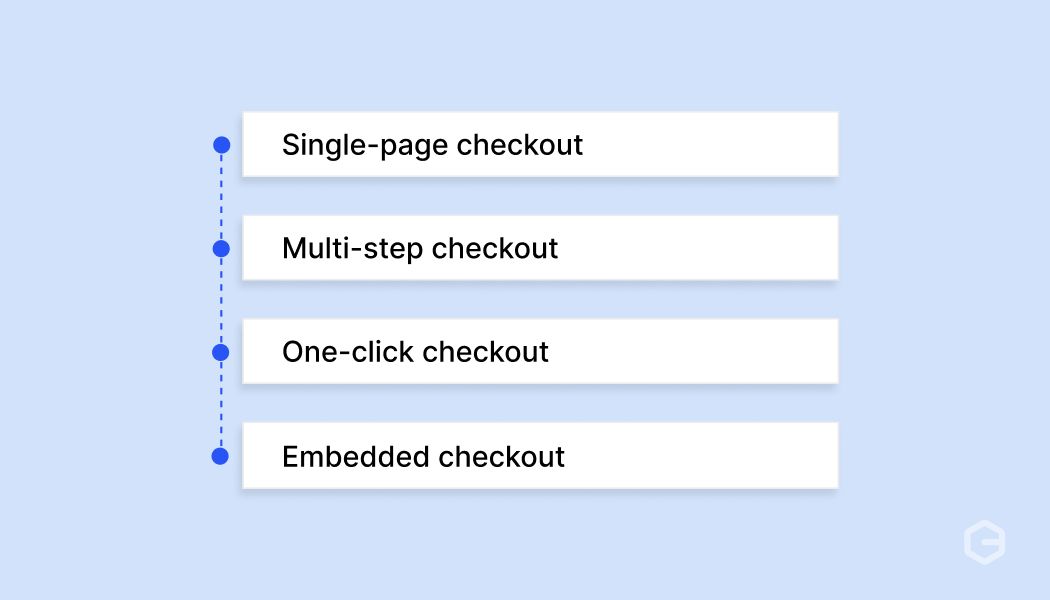
What are the types of checkout flows?
Not every checkout looks the same. The structure you pick affects how long the process feels and how many buyers finish it. Here's a quick comparison:
Each type works well in different situations, so the right choice depends on your product, your buyer, and the average order value.
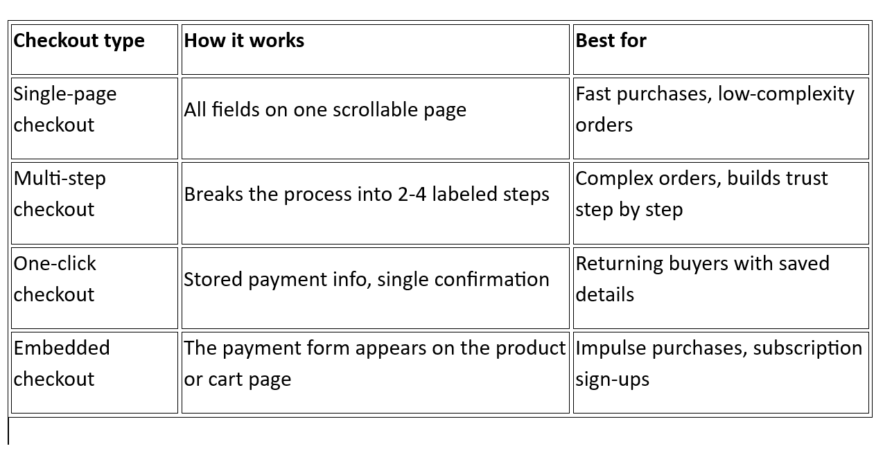
1. Single-page checkout
Everything lives on one page. The buyer fills in shipping, billing, and payment details without navigating away. This works well for simple orders where the buyer already knows what they want. The downside is that a long page can feel overwhelming on mobile. If you sell a single product or run a subscription, this is often the fastest path to purchase.
2. Multi-step checkout
The process breaks into separate steps, usually shipping, payment, and review. A progress bar at the top shows buyers how close they are to finishing. This format works well for higher-value orders or when you need to collect more information. It reduces the feeling of being overwhelmed, but each additional step is a chance for the buyer to leave.
3. One-click checkout
Returning buyers skip the form entirely. Their saved address and payment details auto-fill, and they confirm with a single tap. This is ideal for repeat buyers and subscriptions. It requires the buyer to have completed at least one full checkout before, so it's a retention tool, not an acquisition one.
4. Embedded checkout
The payment form shows up directly on the product or cart page. There's no separate checkout page at all. This reduces the number of clicks and works well for low-price or impulse purchases. For international buyers, you'll still need to present the right currency and payment options within the embedded form.
Tip: If you're not sure which type to start with, single-page checkout is the safest default for most businesses selling online.
Increase international checkout success with PayGlocal
International buyers expect a checkout that feels local to them. When they see unfamiliar currency, limited payment options, or get a card decline, they don't call support. They leave.
PayGlocal is a payment platform built for businesses that sell globally. It handles cards, local payment methods, multi-currency pricing, and fraud protection from a single dashboard.
Here's what it brings to your checkout:
- Dynamic checkout: Your buyers see a payment page that adapts to their location, currency, and preferred payment method, which keeps the experience familiar and fast.
- Card payments: Fewer international card transactions get declined because PayGlocal sends the right transaction data to issuers worldwide, lifting your approval rates.
- Global payment methods: Buyers across 180+ countries can pay with 40+ local payment options, from bank transfers to e-wallets, so nobody leaves for lack of choice.
- Multi-currency accounts: You can collect payments in 33+ currencies and settle locally in USD, GBP, EUR, CAD, and AUD, removing the guesswork around foreign exchange.
- Recurring payments: Subscription billing and scheduled charges happen automatically on international cards, meaning your customers don't need to re-enter payment details each cycle.
Whether you're a brand shipping worldwide, a SaaS company billing in USD, or a travel business processing bookings from dozens of countries, PayGlocal handles the payment complexity so you can focus on growing your business.
Final thoughts
Checkout optimization is an ongoing process of finding and fixing the small friction points that stop your buyers from completing their purchase. For businesses in India selling globally, the checkout carries extra weight because international buyers face currency confusion, limited payment options, and higher card decline rates.
Start with the basic like simplifying your form, and adding the payment methods your top markets expect. Then test, measure, and improve. Even small changes add up to significant revenue over a few months.
If your checkout is losing international buyers to payment friction, PayGlocal can help. It covers 33+ currencies, 40+ payment methods, and 180+ countries from a single platform built for cross-border success. Get started with PayGlocal today and turn more of your global traffic into completed sales, before your competitors do.